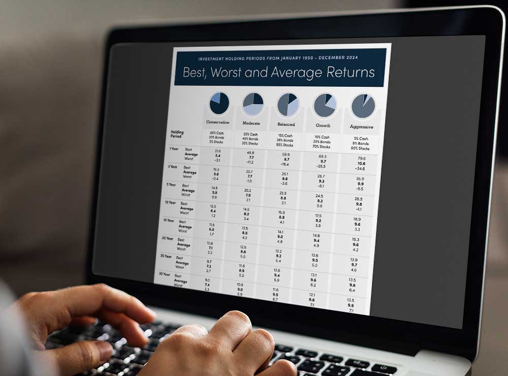
The Investment Holding Periods infographic illustrates how different portfolio combinations perform over time. Designed to help start the conversation about risk and return, the infographic speaks to the best, worst and average returns.
Investment Holding Periods Infographic

Using historical data, discover the best, worst and average returns of investment portfolio types over time.
Discover how time in the market can impact returns with our Investment Holding Periods infographic. This insightful visual explores best, worst, and average returns across a range of portfolios—from very conservative to aggressive—over holding periods from 1 to 30 years. Grounded in historical data from 1950 to 2024, it offers a practical perspective for long-term investors navigating short-term market noise.
Each portfolio shown was rebalanced annually to its original allocation, reflecting disciplined investing in action. The infographic uses well-known Canadian benchmarks: the S&P/TSX Total Return Index for stocks, Canada 10 Year Government Bonds for fixed income, and the TBill Index for cash. The result is a clear, relatable tool that helps illustrate how asset mix and time horizon work together to shape investment outcomes.
For financial professionals, this resource supports meaningful conversations around client goals, expectations, and time frames. It pairs especially well with the Financial Planning Process infographic, creating a foundation for trust, education, and long-term strategy.
Companion Calculator

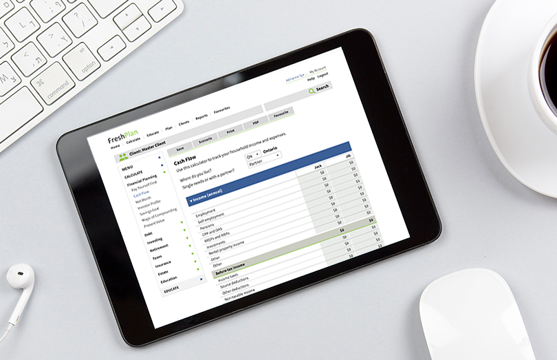
Companion Financial Management calculators help to establish your current financial situation to begin the financial planning process. Companion calculators include:
-
Letter of Engagement
Infographic Features
Communicate Complex Concepts
Financial Infographics are an effective way to take complex ideas, filled with data and facts and simplifying the story using with visuals. When clients and prospects gain insights quickly, the content is more memorable.
Current & Shareable
Manage your client communications with current and timely vibrant infographics to share on social media, via email, in meetings or mailings.
Personalized
Infographics are personalized with the advisor name, contact information and company logo.
